
Saturday, September 5, 2026
No Result
View All Result
LJ News Opinions
  • Home
  • U.S.
  • Politics
  • World News
  • Business
  • Entertainment
  • Sports
  • Technology
  • Health
  • Opinions
  • Home
  • U.S.
  • Politics
  • World News
  • Business
  • Entertainment
  • Sports
  • Technology
  • Health
  • Opinions
No Result
View All Result
LJ News Opinions
No Result
View All Result
Home Opinions

What different world maps get right – and what they get wrong

by LJ News Opinions
September 5, 2026
in Opinions
0
Side-by-side maps of Africa comparing two map projections. The Mercator projection on the left makes Africa appear smaller in comparison with Europe to its north. The Equal Earth projection on the right shows a longer, more proportionally accurate shape of the continent.
Share on FacebookShare on Twitter


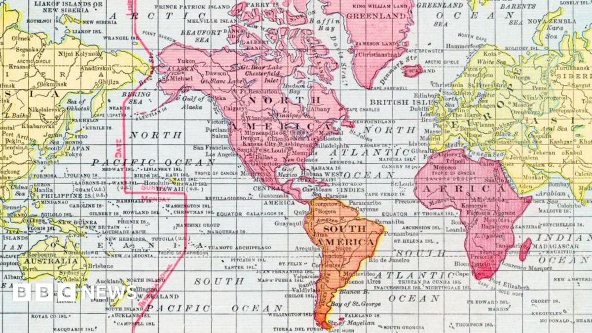
The now widely used Mercator map was created in 1569 by Flemish cartographer Gerardus Mercator.

Its main purpose was to help European sailors navigate the oceans, as cartography Professor James Cheshire at University London College explained.

“He wanted a straight line to be drawn on a map to look like a straight line in reality if you followed a compass bearing,” he told the BBC. “That was what it was intended to do, and that’s what it does brilliantly well.”

To keep those angles correct on a flat map, Mercator had to stretch the grid lines wider as they moved away from the equator toward the poles.

His map accommodates for the curvature of the Earth by making countries near the equator seem much smaller than they are, with countries nearer the poles appearing stretched.

The distortion is a result of it being impossible to accurately represent the surface of a globe on a two-dimensional chart.

More than 450 years on, Mercator’s creation is still the basis for many of the maps we see in classrooms, on TV and online, including Google Maps.

But critics of the Mercator map say there is a psychological effect to viewing some places as smaller than they actually are and others as larger, as we instinctively view bigger things as more important.

For Kenyan geographer Kioko Muendo, this has implicitly downplayed Africa’s vast resources, population and investment opportunities.

“Maps are more than just guides for travellers – they shape how regions are perceived politically and economically,” he told the BBC.



Source link

LJ News Opinions

LJ News Opinions

Next Post

Coach Luis Enrique unconcerned by PSG’s poor start to French league season

Recommended

Settlement in first suit against officer Ronald Watts

2 years ago

Doctor Who makes history with first ever same-sex kiss between actors Ncuti Gatwa and Jonathan Groff as fans praise their ‘electrifying chemistry’

2 years ago

Popular News

    Connect with us

    LJ News Opinions

    Welcome to LJ News Opinions, where breaking news stories have captivated us for over 20 years.
    Join us in this journey of sharing points of view about the news – read, react, engage, and unleash your opinion!

    Category

    • Business
    • Entertainment
    • Health
    • Opinions
    • Politics
    • Sports
    • Technology
    • U.S.
    • World News

    Site links

    • Home
    • About us
    • Contact

    Legal Pages

    • Privacy Policy
    • Cookie Privacy Policy
    • Terms of Use
    • Disclaimer
    • California Consumer Privacy Act (CCPA)
    • DMCA
    • About us
    • Advertise
    • Contact

    © 2024, All rights reserved.

    No Result
    View All Result
    • Home
    • U.S.
    • Politics
    • World News
    • Business
    • Entertainment
    • Sports
    • Technology
    • Health
    • Opinions

    © 2024, All rights reserved.