Any commuter will be familiar with the frustration of just missing a bus or watching their train pull away from the platform.
But an incredible new map promises to make travelling around London a little easier.
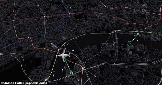
The remarkable creation tracks every tube, train, bus and boat in central London in real-time. It even tracks planes and helicopters, showing them as they fly over the capital.
The map, designed by web coder James Potter, is constantly being fed with data from Transport for London, live departure boards and flight and ship trackers.
Curious travellers can watch their train move along the lines and see the exact time it will pull into the station.
They can also check if their next bus is just around the corner or stuck in traffic miles away.
And for those who want to check how busy the roads are, it even features views from traffic cameras at key spots in the capital.
If you want to try out the map for yourself, it is available here.
The remarkable creation tracks every tube, train, bus and boat is in central London in real-time. It even tracks planes and helicopters, showing them as they fly over the capital
While there have been several live maps of the London Underground created, this appears to be the first that combines all modes of transport.
Viewing the map will reveal the sprawl of London’s topography overlaid with colourful lines representing each of the different Tube lines.
Within these, you will be able to see the trains as they move between stations.
If you want even more information, hover over any of the trains to pull up a more detailed description.
This will reveal the train’s serial number, origin, destination and how far it is from its next stop.
The map also includes overground trains, such as ones travelling further afield to Kent.
Data-obsessed commuters can also zoom in to see the license plate of each bus and when it will reach its next stop.
Hovering a mouse over a boat will also trigger a pop-up showing an image of the vessel, as well as its size and how fast it is currently moving.

If you want even more information, hover over any of the trains to pull up a more detailed description

Data-obsessed commuters can also zoom in to see the license plate of each bus and when it will reach its next stop
Mr Potter, who shared his creation on X, said: ‘A live map of central London.
‘Every tube train, bus, mainline train, riverboat and aircraft on screen is real and moving in real time, placed from public transport and tracking feeds.
‘Hover or tap a vehicle for details, click a station for departures, a camera for its live picture.’
He revealed his ‘just for fun’ creation only took him around one day to generate using an AI coding model called Fable.
‘Trains and buses have no GPS feed, so their positions are inferred from arrival countdowns and departure boards, then animated along the track/route geometry,’ he explained.
One person commented: ‘Very impressive! With the level of details, Big Ben and the London Eye.’
Another wrote: ‘I could easily waste three hours watching a random bus cross a bridge on this.’
Someone suggested he add in pedestrian density data to show roughly how many people are in each area at any given time.

For those who want to check how busy the roads are, it even features views from traffic cameras at key spots in the capital

Hovering a mouse over a boat will also trigger a pop-up showing an image of the vessel, as well as its size and how fast it is currently moving
The new map also reveals how misleading the real London Underground map can be.
Rather than connecting in a neat grid as Transport for London’s (TfL) version would suggest, the real layout of the Tube is far more spread out.
Likewise, looking from above it is also clear just how much the London Underground favours locations north of the river, with just a few solitary lines extending into the south.
Whether you live in London or not, the map is a unique way to explore the city’s chaotic transport system.


