
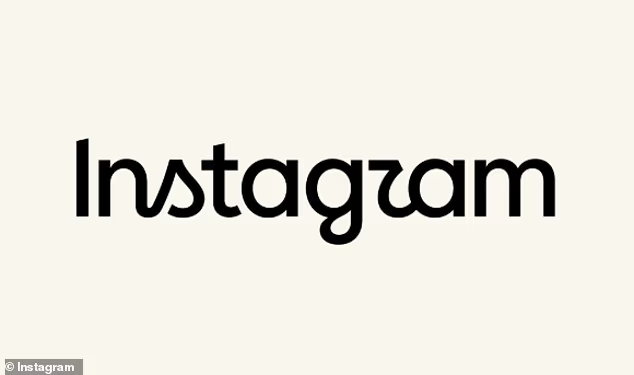
If you use Instagram, you may have noticed a subtle change in the app this week.
The Meta–owned app has quietly changed its logo – and many users are unhappy about it.
Instagram claims the new logo – its first in 10 years – is a ‘forward–looking evolution’.
‘Script reflects individuality, so referencing that felt right,’ said Jasmine Probst, Director of Product Design at Instagram.
‘The new wordmark is bolder and simpler, with touches of unexpectedness.
‘It cues individual expression, a personal voice, both of which have always been core to Instagram.’
However, many users claim that the new logo is difficult to read, with one even calling it an ‘absolute abomination’.
Taking to X, another asked: ‘So we’re all reading the new Instagram logo as InstagZAM right?’
If you use Instagram, you may have noticed a subtle change in the app this week. The Meta–owned app has quietly changed its logo – and many users are unhappy about it

Taking to X, one user asked: ‘So we’re all reading the new Instagram logo as InstagZAM right?’
The new logo is part of Instagram’s refreshed brand identity, and has already been updated at the top of the Instagram app.
According to Meta, the design team explored ‘hundreds of directions’ for the logo, including all–caps, camera concepts, and literal handwriting.
Eventually, the team settled on a rounded font, with fewer letters joined together as in the previous iteration.
‘The refreshed brand system puts our community’s creativity and self–expression front and center,’ said May Hartono, Director of Brand Design at Meta.
‘It’s designed to spark courageous action and give people the confidence to create and show up as themselves, freely and fully.’
Across social media it seems users’ main issue with the new logo is the legibility of the ‘r’.
‘Yo dog, what’s your Instagzam?’ one user asked on X.
Another said: ‘Instagram’s new logo. Or should I say Instagzam.’

The new logo is part of Instgram’s refreshed brand identity, and has already been updated at the top of the Instagram app

One joked: ‘The new Instagzam logo reminds me of the fact that when i was growing up, I thought the Disney logo said “Disnep”‘
And one joked: ‘The new Instagzam logo reminds me of the fact that when i was growing up, I thought the Disney logo said “Disnep”.’
Others simply claim the new logo is ‘ugly’.
One said: ‘Not that I like Instagram but the old logo at least had some charm to it. The new one looks like some bulls*** startup for a hipster coffee brand or something.
‘How much do people get paid to make corporate logos uglier?’
Another vented: ‘i’m sorry but the new instagram logo is so ugly..’
And one asked: ‘Why are modern logos always so much worse than old logos? It’s weird.’
Meanwhile, several other brands have joined in the mocking, posting their own ‘new logos’ using Instagram’s font.
ChatGPT, McDonald’s and KitKat were just a few of the companies to join in the fun, with KitKat writing: ‘One thing that will never change: the importance of having a break’.


