The secret to a mood-boosting garden may lie not in what you plant, but what shade it blooms in.
Scientists at the Royal Horticultural Society have found that those with green fingers are drawn overwhelmingly to vivid, saturated flower colours, with red topping the list for the love and admiration it inspires.
The more intense the hue, the stronger the emotional pull, the researchers found, with muted, dark and pale tones all producing far weaker reactions.
Yellow came a close second, producing the highest scores for happiness and joy, while grey and white blooms were rated calming but boring.
The findings emerged from a study of more than 11,000 visitors to RHS Wisley Garden in Surrey, who were shown more than 30 flower hues on a screen for 15 seconds before selecting the emotion each one triggered.
Green and cyan blooms were linked to courage and pride, while cooler shades such as blue and purple inspired calm and relaxation more than any other colours.
‘Our findings highlight the psychological significance of flower colours in shaping emotional experiences,’ said co-author Professor Ross Cameron, professor of environmental horticulture at the University of Sheffield.
‘The study provides evidence for designing gardens that support emotional wellbeing through colour selection.’
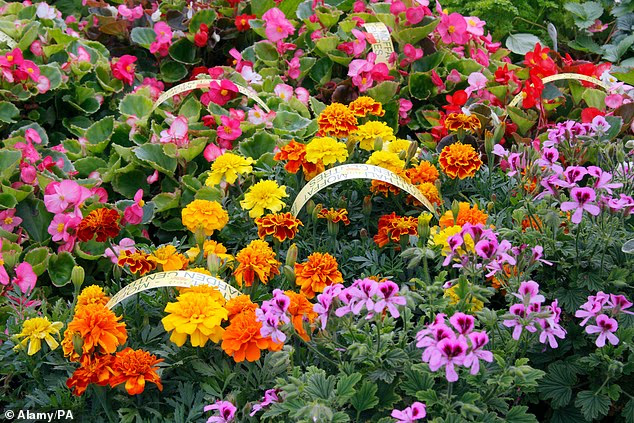
Scientists at the Royal Horticultural Society found those with green fingers are drawn overwhelmingly to vivid, saturated flower colours

Red flowers topped the list for gardeners, due to the love and admiration it inspires
Vivid hues accounted for six in ten of gardeners’ favourite shades overall, the study found, followed by muted tones on 18 per cent, dark colours on 12 per cent and light colours on eight per cent.
Yellow and orange blooms were most likely to be chosen by those seeking joy, while orange and yellow were also favoured by gardeners looking for an energy boost.
Dark-coloured flowers were associated with contentment and admiration, but scored lower for feelings of pride, love and relief, the research found.
‘Saturated warm flower colours, like red, yellow and purple, can be used to energise spaces, whereas light and muted cool colours, like blue and green, promote relaxation,’ said Professor Cameron.
‘By attending to saturation, brightness and colour, designers can more precisely shape emotional outcomes in gardens.’
Red’s dominance held firm across three of the four seasons, the study found, but was pipped by yellow during spring.
The research, led by Dr Ashby Sachs, is published in the journal Acta Psychologica.